
Thoughtful design lays the framework for telling Geller’s story
Geller is the quintessential family office, supporting every facet of their clients’ financial lives from tax advisory to wealth management. Following their move to merge Geller and Company with Geller advisors, they reached out to us to reflect this change in their website.
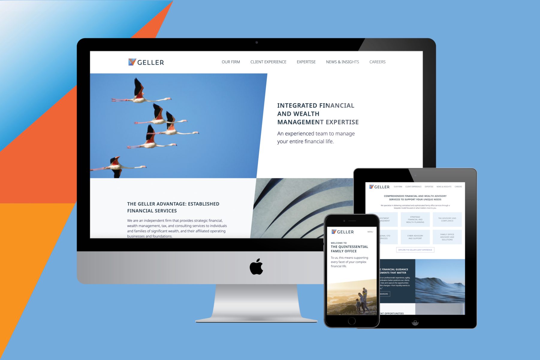
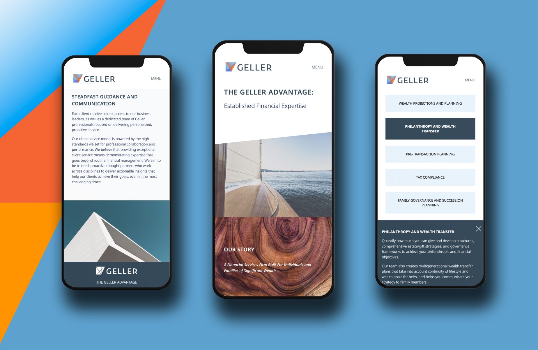
Our deceptively simple page designs make use of angled lines, echoing elements from their logo. In addition to leveraging design to accommodate Geller’s branding, it also accommodates content from both sites, presenting Geller’s wealth of information strategically so as to align with their modern, sophisticated visual identity. For example, a prominent page layout presents content in sections, split vertically to pair copy with photography. By alternating the copy-image/image-copy order, neither format overwhelms the visitor.
To similar ends, content exists on more pages than fewer, with internal links to improve page flow so that visitors can “choose their own adventure” as they navigate the site’s story. Thoughtful CTAs give visitors the opportunity to develop their relationship with Geller on their own terms.
Ease-of-use is of equal importance behind the scenes, too. The CMS makes it easy to add new content—video included—, updates without security concerns, and includes Salesforce and Pardot integrations for greater visitor tracking. In other words, our redesign does more but requires less effort.
The finished product is future-minded: a tool that will help Geller continue to develop their relationships, allowing them to grow alongside their clients, just as they always have.
Geller’s site is future minded so they can grow alongside their clients

