

Developing a new brand for holiday icon turned rock star
Frosty the Snowman, holiday icon beloved by kids from one to ninety-two, needs little introduction. So deeply is he entrenched in the American mythos, his typical attire (old silk hat, corn cob pipe, carrot nose, etc.) has become synonymous with standard Snowman garb.
Looking to maintain his relevance and legacy, Frosty approached us for a rebrand. Our objective was to stay true to his core values while accommodating his daring career switch… from public figure to the frontman of Frosty and the Sno-Jams.
Our rebranding efforts began with a complete makeover. Most notably, we eschewed many elements of Frosty’s typical dress, replacing and intermingling them with rock-n-roll statement pieces. His new look harkens back to tradition but is able to stand on its own two feet. Which Frosty now has.
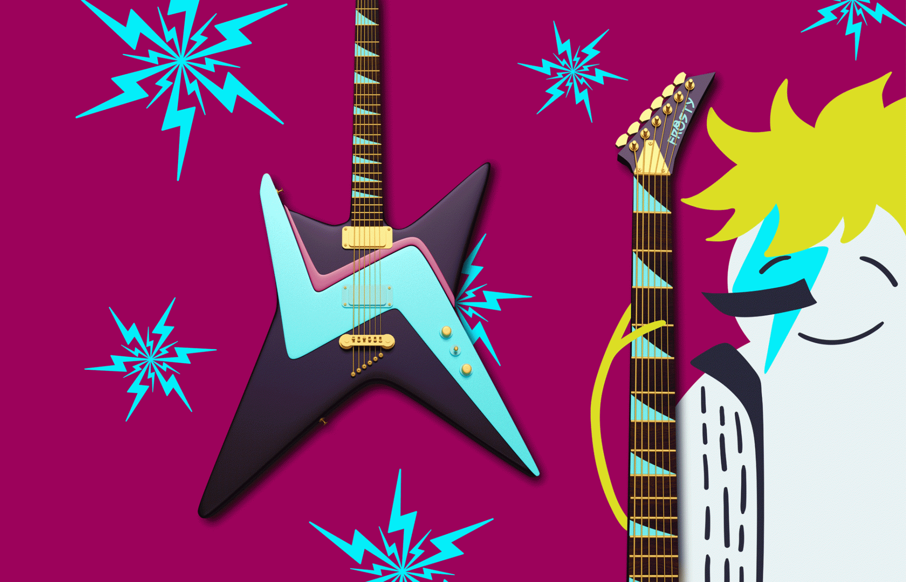
We approached his logo and design materials with a similar ethos. A color palette of cool-toned magenta, lime green, and aqua are distinct, edgy, and subtly nod to the colors of his previous image. We took greater freedom with his logo system, drawing font inspiration from rock logos of auld lang syne. The result is a balance between new and old, playful and rebellious. The new visual style guide to a number of “firsts” for us, including instrument designs, concert tickets, tour bus, and concert stage design.
It has been an honor to work with Frosty and the Sno-Jams in developing a brand that can rock and roll all nite, and beyond.
Frosty’s new look is modern, yet harkens back to auld lang syne


